

Gary wrote...
...No, it's a coincidence that I included it in the same release. It's just that I've read on other forums that our software is not "pretty" and every now and again I am going to try and improve this.
Gary,
As a loyal Gruss user I wouldn’t be promoting any other vendors software. So loyal users of other software, well, if the worse they can say is “it’s not pretty” I would take as a compliment. I can use words like stability and function when referring to other software.
In my honest opinion the Betting Assistant Is very pleasing on the eye, it has soft but distinguishable lines and your choice of default colours (all but one) would rank you with the best interior designers lol, but that of course is just my opinion.
So let’s be critical, and consider a new user downloading the BA for the first time and not knowing yet, its outstanding customisability.
My criticisms (as a new user) would be...
... yuck, the mustard betting options colour just doesn’t go with the other subtle colours.
And second, but far more important, you are immediately hit with a cluttered interface, most options are ticked and there are far too many whistles and bells on display.
The array of options are great for experienced users who want to use them, but maybe you should make the “default” a very simple, basic interface, and promote all the “grid interface” options in a very detailed screenshot.
I’m sure Gary and Mark would welcome all of their customers honest views on how “pretty” they think the Betting Assistant is.
Maybe if you just list your “likes” and “dislikes”, or like me, just give it a big thumbs up.
Thanks all.
How "Pretty" Is The B/Assistant
Moderator: 2020vision
46 posts
• Page 1 of 4 • 1, 2, 3, 4
How "Pretty" Is The B/Assistant
![]() by pugs » Sat Aug 15, 2009 10:23 am
by pugs » Sat Aug 15, 2009 10:23 am
-

pugs - Posts: 469
- Joined: Tue Feb 06, 2007 6:37 pm
![]() by doris_day » Sat Aug 15, 2009 10:45 am
by doris_day » Sat Aug 15, 2009 10:45 am
As the old saying goes, " beautiful is as beautiful does ".......
-

doris_day - Posts: 968
- Joined: Fri Nov 02, 2007 12:34 am
![]() by Ian » Sat Aug 15, 2009 10:55 am
by Ian » Sat Aug 15, 2009 10:55 am
I didn't like the 3d effect at first, but I've slightly changed the back and lay colours and I quite like it now. It will look even better if the 3d effect is added to the selection name column. I agree about the mustard colour and have changed that !!
The one thing that irritates me is the position of the staking mode box between exposure and commission. Not only is it out of sequence, the other boxes relating the account rather than this particular market, I click it by accident too many times when wanting to look at tab two !!
The one thing that irritates me is the position of the staking mode box between exposure and commission. Not only is it out of sequence, the other boxes relating the account rather than this particular market, I click it by accident too many times when wanting to look at tab two !!
- Ian
- Posts: 834
- Joined: Sat Nov 19, 2005 8:35 am
- Location: Birmingham
![]() by GaryRussell » Sat Aug 15, 2009 12:23 pm
by GaryRussell » Sat Aug 15, 2009 12:23 pm
Good thread. Please keep posting, I am taking note 
ps. I changed the default back and lay colours to the exact same colours as the Betfair website so if you want to use those colours open colour preferences and set to default.
ps. I changed the default back and lay colours to the exact same colours as the Betfair website so if you want to use those colours open colour preferences and set to default.
Last edited by GaryRussell on Sat Aug 15, 2009 12:25 pm, edited 1 time in total.
-

GaryRussell - Site Admin
- Posts: 9949
- Joined: Fri Nov 18, 2005 8:09 pm
- Location: Birmingham, UK
![]() by GaryRussell » Sat Aug 15, 2009 12:36 pm
by GaryRussell » Sat Aug 15, 2009 12:36 pm
Everyone please feel free to state which application from the competition in your opinion is the most aesthetically pleasing and why. I would be interested to hear. It could give me some ideas 
-
GaryRussell - Site Admin
- Posts: 9949
- Joined: Fri Nov 18, 2005 8:09 pm
- Location: Birmingham, UK
![]() by GaryRussell » Sat Aug 15, 2009 12:38 pm
by GaryRussell » Sat Aug 15, 2009 12:38 pm
Also I don't want you to get the impression that I will put "prettying" up the program above other requests. I will only do a little now again when I find time.
-
GaryRussell - Site Admin
- Posts: 9949
- Joined: Fri Nov 18, 2005 8:09 pm
- Location: Birmingham, UK
![]() by milfor » Sat Aug 15, 2009 2:41 pm
by milfor » Sat Aug 15, 2009 2:41 pm
pugs wrote:... yuck, the mustard betting options colour just doesn’t go with the other subtle colours.
Ian wrote:I agree about the mustard colour and have changed that !!
So I am not the only one.
Yes, BA seems complicated when opened the first time. But all those parts are useful and it's not a bad idea that new users see all the fantastic features like stop loss etc. at first sight. Functionality should always precede beauty.
- milfor
- Posts: 437
- Joined: Mon Jun 26, 2006 1:44 am
![]() by danjuma » Sat Aug 15, 2009 8:38 pm
by danjuma » Sat Aug 15, 2009 8:38 pm
GaryRussell wrote:Everyone please feel free to state which application from the competition in your opinion is the most aesthetically pleasing and why. I would be interested to hear. It could give me some ideas
Aesthetically, BA is not the worst out there, and it's not that bad once you change the mustard colour for the Betting options to a more nice colour. I use light purple.
IMO, the best aesthetically is BetAngel Pro, but then BA has more options to display like the Quick pick list etc.
I also find the blue background colour for the selection names not that appealing, however, I can't change it to anything else because the names are written in yellow. May be white background with black writing, or the option to change the colour of the writing as well?
Anyway, all the above is petty. BA is still the best out there in terms of automated betting and value for money, and not to forget, the first class support from the team.
Dan
-

danjuma - Posts: 347
- Joined: Mon Apr 21, 2008 4:17 pm
![]() by Ian » Sat Aug 15, 2009 11:22 pm
by Ian » Sat Aug 15, 2009 11:22 pm
You can change the selection name colour by right clicking the box - I use black on yellow as I sometimes use BA outside and find this easier to read in sunlight.
- Ian
- Posts: 834
- Joined: Sat Nov 19, 2005 8:35 am
- Location: Birmingham
![]() by pugs » Sun Aug 16, 2009 12:14 am
by pugs » Sun Aug 16, 2009 12:14 am
I think Gary may have been consuming a delicious ham and mustard sandwich whilst working on “betting options” and chose to preserve the moment lol
Milfor, Yes I agree with you for the main betting options, field, tick, stop, ect, I just didn’t explain myself very well. I just meant the betting grid. There are a few low key (imo, so please no one shout) options ticked by default, which makes the grid look very busy/daunting. Until of course it’s understood/customised.
The “betting options” looks nothing amazing, but when you consider the amount of options/features in there, well it’s a work of art. I remember when Gary was working 23 hours a day, and it seemed like we were getting new features every week, the betting options became a cluttered minefield, but now, well I think Doris Days post above sums that up perfectly.
Anyway, the main reason for this post.....
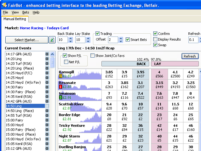
..... NOT believing anyone could think our BA wasn’t pretty, I picture searched “Betfair” to see screenshots of what other users were looking at all day, and did find one thing that I found interesting/pretty. In the link below, the price graph is incorporated in the selection column.
http://www.binteko.com/images/fairbot1.gif
I personally think the graph should be less bold so the selection name is crystal clear, but it is pretty and still functional.
With our new graphs/charts, our old “price history” graph is basically just a quick view/indicator, so would still serve its purpose. It would also free up valuable real estate for people who use the new bets manager, which would be a bonus.
Gary, now you have used the Betfair back/lay colours as “default” will we lose the Gruss back/lay colours? I think the Gruss background/back/lay complement each other very well, and it would be a shame to lose them. I know this post is not for suggestions but could we have “Betfair default” “Gruss default” Or post the colour number/value somewhere so we can replicate it exactly in “custom colours”
Milfor, Yes I agree with you for the main betting options, field, tick, stop, ect, I just didn’t explain myself very well. I just meant the betting grid. There are a few low key (imo, so please no one shout) options ticked by default, which makes the grid look very busy/daunting. Until of course it’s understood/customised.
The “betting options” looks nothing amazing, but when you consider the amount of options/features in there, well it’s a work of art. I remember when Gary was working 23 hours a day, and it seemed like we were getting new features every week, the betting options became a cluttered minefield, but now, well I think Doris Days post above sums that up perfectly.
Anyway, the main reason for this post.....
..... NOT believing anyone could think our BA wasn’t pretty, I picture searched “Betfair” to see screenshots of what other users were looking at all day, and did find one thing that I found interesting/pretty. In the link below, the price graph is incorporated in the selection column.
http://www.binteko.com/images/fairbot1.gif
I personally think the graph should be less bold so the selection name is crystal clear, but it is pretty and still functional.
With our new graphs/charts, our old “price history” graph is basically just a quick view/indicator, so would still serve its purpose. It would also free up valuable real estate for people who use the new bets manager, which would be a bonus.
Gary, now you have used the Betfair back/lay colours as “default” will we lose the Gruss back/lay colours? I think the Gruss background/back/lay complement each other very well, and it would be a shame to lose them. I know this post is not for suggestions but could we have “Betfair default” “Gruss default” Or post the colour number/value somewhere so we can replicate it exactly in “custom colours”
-
pugs - Posts: 469
- Joined: Tue Feb 06, 2007 6:37 pm
![]() by doris_day » Sun Aug 16, 2009 7:40 am
by doris_day » Sun Aug 16, 2009 7:40 am
Well, as I've indicated, I personally dont mind too much about the look as long as the app does the job required.
BA has, in all honesty though been a bit of a dogs dinner aesthetically. A bit like the dashboard of an old 911 I used to have where new buttons and switches were added almost randomly. It did the job however and had some sort of charm too.
There is absolutely no doubt whatsoever that there has only ever been one Betfair interface which stood out head and shoulders above all others and that was STW designed by Vince Coldrick. Sadly STW is no more, mainly because of poor marketing imo but Vince's work still can be seen in the Betdaq Trader which has the same beauty. He writes in Java and I don't know if they have better controls but I've always found Java interfaces somehow look nicer. Perhaps its the people who use Java, I dont know.
But the real test of an app is what and how it does its job and BA is well ahead of the game at the moment and its appearance is of minor importance to me. There is loads of STW functionality that BA could include however and I'd encourage the Russells to take a look at the old STW manual if they have one hanging about. If they dont I can always send them one....
-
doris_day - Posts: 968
- Joined: Fri Nov 02, 2007 12:34 am
![]() by GaryRussell » Sun Aug 16, 2009 7:47 am
by GaryRussell » Sun Aug 16, 2009 7:47 am
I don't have a copy of the STW manual so would appreciate a copy.
thanks
Gary
ps. I think I remember seeing that STW was pulled because of a disagreement between them and Betfair as it was a dual exchange application and it's against Betfair's terms and conditions.
thanks
Gary
ps. I think I remember seeing that STW was pulled because of a disagreement between them and Betfair as it was a dual exchange application and it's against Betfair's terms and conditions.
-
GaryRussell - Site Admin
- Posts: 9949
- Joined: Fri Nov 18, 2005 8:09 pm
- Location: Birmingham, UK
![]() by GaryRussell » Sun Aug 16, 2009 8:15 am
by GaryRussell » Sun Aug 16, 2009 8:15 am
I think the Gruss background/back/lay complement each other very well, and it would be a shame to lose them. I know this post is not for suggestions but could we have “Betfair default” “Gruss default” Or post the colour number/value somewhere so we can replicate it exactly in “custom colours”
I'll see what I can do. In the meantime here are the values.
Back = 173,216,230 (red,green,blue)
Lay = 255,182,193
-
GaryRussell - Site Admin
- Posts: 9949
- Joined: Fri Nov 18, 2005 8:09 pm
- Location: Birmingham, UK
![]() by pugs » Sun Aug 16, 2009 9:24 am
by pugs » Sun Aug 16, 2009 9:24 am
Cheers Gary, I will save them in case i have to do a clean install
There is definitely something different about java, Gruss’s own Betdaq Assistant has a different look about it. Not sure whether I prefer it or not. All the edges seem bolder/sharper. I would love to see our BA, same layout/colour, in java, I bet it would look totally different.
If I had to guess, I would say java uses many, many more pixels. It has a silky look to it.
I know Gary and Mark threw their Betdaq app together in a matter of weeks, so can be forgiven for it looking like it was thrown together in a matter of weeks lol. But have to say the “back stake” “lay stake” and buttons below, look stunning. A little small for my own personal taste and maybe a little dark, but they are very “classy” and truly stunning.
-
pugs - Posts: 469
- Joined: Tue Feb 06, 2007 6:37 pm
![]() by doris_day » Sun Aug 16, 2009 10:38 am
by doris_day » Sun Aug 16, 2009 10:38 am
GaryRussell wrote:I don't have a copy of the STW manual so would appreciate a copy.
thanks
Gary
ps. I think I remember seeing that STW was pulled because of a disagreement between them and Betfair as it was a dual exchange application and it's against Betfair's terms and conditions.
OK, I'll email that today.
Well, it never became a dual app because BF wouldn't let them do it and I doubt they got many users for BD anyway. Because of their LOT technology (they stripped redundant data from BF on their servers and then pushed any changes to their users apps), their overhead charges were quite high and so they needed a much greater user base than most before they became profitable. I still think their app had legs without the LOT technology and I believe it would have worked as a normal API app. OK, much of what they marketed STW for would have been lost but I think the main core of what it did could have been retained but both Ken and Vince, who ran STW, are now doing other things. Great shame in my view as it was a beauty to behold and had some unique functionality which I'd pay good money to be replicated
-
doris_day - Posts: 968
- Joined: Fri Nov 02, 2007 12:34 am
46 posts
• Page 1 of 4 • 1, 2, 3, 4
Who is online
Users browsing this forum: Bing [Bot] and 30 guests